本帖转自:“
http://www.cnblogs.com/jr1993/p/4658772.html”
闲暇之余逛了下博客园发现一篇比较好玩的博客,就转了过来。
本帖附有源码
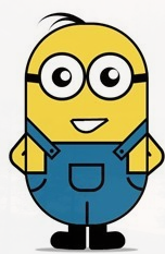
1 html整体结构
<div class="wrapper"><!-- 容器 -->
<div class="littleH"><!-- 小黄人 -->
<div class="bodyH"><!-- 身体 -->
<div class="trousers"><!-- 裤子 -->
<div class="condoleBelt"><!-- 吊带 -->
<div class="left"></div>
<div class="right"></div>
</div>
<div class="trousers_top"></div><!-- 裤子突出的矩形部分 -->
<div class="pocket"></div><!-- 裤袋 -->
<!-- 三条线 -->
<span class="line_left"></span>
<span class="line_right"></span>
<span class="line_bottom"></span>
</div>
</div>
<div class="hair"><!-- 头发 -->
<span class="left_hair_one"></span>
<span class="left_hair_two"></span>
</div>
<div class="eyes"><!-- 眼睛 -->
<div class="leftEye"><!-- 左眼 -->
<div class="left_blackEye">
<div class="left_white"></div>
</div>
</div>
<div class="rightEye"><!-- 右眼 -->
<div class="right_blackEye">
<div class="right_white"></div>
</div>
</div>
</div>
<div class="mouse"><!-- 嘴巴 -->
<div class="mouse_shape"></div>
</div>
<div class="hands"><!-- 双手 -->
<div class="leftHand"></div>
<div class="rightHand"></div>
</div>
<div class="feet"><!-- 双脚 -->
<div class="left_foot"></div>
<div class="right_foot"></div>
</div>
<div class="groundShadow"></div><!-- 脚底阴影 -->
</div>
</div>
2 对容器和整体做一些简单的样式设置
body{
margin: 0;
padding:0;
}
.wrapper{
width: 300px;
margin:100px auto;
}
.litteH{
position: relative;
}
.bodyH{
position: absolute;
width: 240px;
height: 400px;
border:5px solid #000;
border-radius: 115px;
background: rgb(249,217,70);
overflow: hidden;
z-index: 2;
}
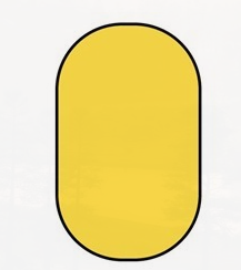
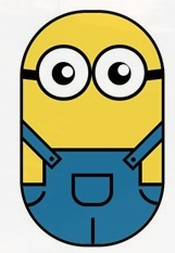
3 绘制身体
其中.bodyH主要是绘制小黄人的身体,效果如下:
.bodyH .condoleBelt{
position: absolute;
}
.bodyH .trousers{
position: absolute;
bottom: 0;
width: 100%;
height: 100px;
border-top: 6px solid #000;
background: rgb(32,116,160);
}
.trousers_top{
width: 160px;
height: 60px;
border:6px solid #000;
border-bottom: none;
border-radius: 0 0 5px 5px;
background: rgb(32,116,160);
position: absolute;
bottom: 100px;
left:34px;
}
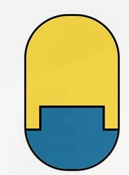
4 穿裤子
其中.trousers_top就是矩形部分,那么穿完裤子是什么样子的呢?
5 吊带
现在怎么看都像一颗胶囊,不行,赶紧修饰修饰,给它一个吊带,不然裤子会掉呢:
.bodyH .condoleBelt .left,
.bodyH .condoleBelt .right{
width: 100px;
height: 16px;
border:5px solid #000;
background: rgb(32,116,160);
position: absolute;
top:-90px;
left:-35px;
z-index: 2;
-webkit-transform:rotate(45deg);
}
.bodyH .condoleBelt .left{
top:-88px;
left:165px;
-webkit-transform:rotate(-45deg);
}
.bodyH .condoleBelt .left:after,
.bodyH .condoleBelt .right:after{
content: '';
width: 8px;
height: 8px;
border-radius: 50%;
background: #000;
position: absolute;
top:4px;
left:88px;
}
.bodyH .condoleBelt .left:after{
left:5px;
} 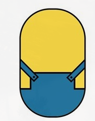
6 裤带的修饰
.pocket{
width: 60px;
height: 45px;
border:6px solid #000;
border-radius: 0px 0px 25px 25px;
position: absolute;
bottom:65px;
left:84px;
}
.line_right{
width: 30px;
height: 30px;
border-bottom-left-radius: 100px;
border-bottom:6px solid #000;
border-left:6px solid #000;
position: absolute;
left: 0;
bottom:60px;
-webkit-transform:rotate(-75deg);
}
.line_left{
width: 30px;
height: 30px;
border-bottom-right-radius: 100px;
border-bottom:6px solid #000;
border-right:6px solid #000;
position: absolute;
right: 0;
bottom:63px;
-webkit-transform:rotate(75deg);
}
.line_bottom{
height: 40px;
border:3px solid #000;
border-radius: 3px;
position: absolute;
left:118px;
bottom: 0px;
}
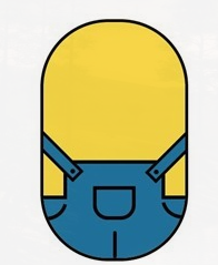
OK,两个注意点说一下:
(2)我把裤子放在身体里面,然后给.bodyH添加overflow:hidden,这样我们就不用去多虑溢出怎么办,而且很轻松就能实现裤子的效果;
(2)可以看到裤子两边有两条有弧度的曲线段,我是通过给矩形某一个角实现圆角效果,然后只设置与这个角相邻的两条边的边框样式,然后旋转一下角度就实现这个效果了,当然只能实现简单一点的效果。
7 眼睛
.eyes{
position: relative;
z-index: 3;
}
.eyes .leftEye,.eyes .rightEye{
width: 85px;
height: 85px;
border-radius: 50%;
border:6px solid #000;
background: #fff;
position: absolute;
top:60px;
left: 27px;
}
.eyes .leftEye{
left: 124px;
}
.eyes .leftEye .left_blackEye,
.eyes .rightEye .right_blackEye{
width: 40px;
height: 40px;
border-radius: 50%;
background: #000;
position: absolute;
top:24px;
left:22px;
}
.eyes .leftEye .left_blackEye .left_white,
.eyes .rightEye .right_blackEye .right_white{
width: 20px;
height: 20px;
border-radius: 50%;
background: #fff;
position: absolute;
top:7px;
left:17px;
}
.eyes .leftEye .left_blackEye .left_white{
top:4px;
left:17px;
}
.eyes .leftEye:after,
.eyes .rightEye:after{
content: '';
width: 28px;
height: 18px;
background: #000;
position: absolute;
left:-30px;
top:37px;
-webkit-transform:skewX(20deg) rotate(7deg);
}
.eyes .leftEye:after{
left:89px;
top:37px;
-webkit-transform:skewX(-20deg) rotate(-7deg);
}
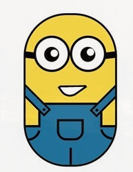
8 嘴巴
.mouse{
position: relative;
}
.mouse .mouse_shape{
width: 55px;
height: 35px;
border:5px solid #000;
border-bottom-left-radius: 30px;
background: #fff;
position: absolute;
top:175px;
left:98px;
z-index: 3;
-webkit-transform:rotate(-35deg);
}
.mouse .mouse_shape:after{
content: '';
width: 70px;
height: 32px;
border-bottom:5px solid #000;
border-radius:35px 26px 5px 5px;
background: red;
position: absolute;
top:-16px;
left:3px;
-webkit-transform:rotate(34deg);}
.mouse .mouse_shape:after{
content: '';
width: 70px;
height: 32px;
border-bottom:5px solid #000;
border-radius:35px 26px 5px 5px;
background: rgb(249,217,70);
position: absolute;
top:-16px;
left:3px;
-webkit-transform:rotate(34deg);
-webkit-animation: mouse_mask 5s ease-in-out infinite;
}
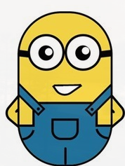
9 双手
.mouse .mouse_shape:after{
content: '';
width: 70px;
height: 32px;
border-bottom:5px solid #000;
border-radius:35px 26px 5px 5px;
background: rgb(249,217,70);
position: absolute;
top:-16px;
left:3px;
-webkit-transform:rotate(34deg);
-webkit-animation: mouse_mask 5s ease-in-out infinite;
}
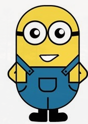
10 双脚
.feet{
position: relative;
}
.feet .left_foot,
.feet .right_foot{
width: 36px;
height: 50px;
border-bottom-right-radius: 6px;
border-bottom-left-radius: 9px;
background: #000;
position: absolute;
top: 406px;
left:88px;
-webkit-transform-origin: right top;
}
.feet .left_foot{
border-bottom-right-radius: 9px;
border-bottom-left-radius: 6px;
left:130px;
-webkit-transform-origin: left top;
}
.feet .left_foot:after,
.feet .right_foot:after{
content: '';
width: 60px;
height: 35px;
border-radius: 20px 10px 21px 15px;
background: #000;
position: absolute;
left:-36px;
top:14.4px;
-webkit-transform:rotate(5deg);
}
.feet .left_foot:after{
border-radius: 10px 20px 15px 21px;
left:13px;
-webkit-transform:rotate(-5deg);
}
11 头发
.hair{
position: relative;
}
.left_hair_one{
width: 130px;
height: 100px;
border-radius: 50%;
border-top:8px solid #000;
position: absolute;
left:17px;
top:-17px;
-webkit-transform:rotate(27deg);
}
.left_hair_two{
width: 80px;
height: 80px;
border-radius: 50%;
border-top:6px solid #000;
position: absolute;
left:45px;
top:-10px;
-webkit-transform:rotate(15deg);
}
12 脚底阴影
.groundShadow{
width: 200px;
height: 2px;
border-radius: 50%;
background: rgba(0,0,0,0.3);
box-shadow: 0 0 2px 4px rgba(0,0,0,0.3);
position: relative;
top: 455px;
left:25px;
}
13 动态效果
实现思路:
(1)头发:头发我想实现的是被小风轻轻地吹起来,然后很快就塌下去,所以吹起和下塌分配的时间很关键;
(2)眼睛:眼睛我设想的场景是小黄人在悠闲地走路,然后不时左右看一下两边的风景,所以眼睛转动很悠哉,所以分配的时间可以稍微长一点点;
(3)嘴巴:让嘴巴动起来确实比较难,因为要动的话,遮罩也得实时跟着改变,而且不能露馅,所以最后实现的是当它往左边看了一下之后卖了一下萌;
(4)双手和双脚:这部分确实很难逼真,本来脚就不是正常的走路状态,所以只能按卓别林老爷爷的走路方式模拟一下,而且左右脚动作是紧接实现而不是同步实现。双手的话,我是简单模拟人在走路时有摆手的自然惯性,而且是左脚配右手,右脚配左手。考虑到它的双手是放在背后的,所以我的摆动幅度设置为非常小,有效果但不明显。
.left_hair_one{
-webkit-animation: lefthair 2s ease-in-out infinite;
}
@-webkit-keyframes lefthair{
0%,25%,31%,100%{
}
30%{
-webkit-transform: rotate(31deg) translate3d(-3px,-1px,0);
}
}
.eyes .leftEye .left_blackEye,
.eyes .rightEye .right_blackEye{
-webkit-animation: blackeye 5s ease-in infinite;
}
@-webkit-keyframes blackeye{
0%,20%,50%,70%,100%{
-webkit-transform: translateX(0px);
}
30%,40%{
-webkit-transform: translateX(15px);
}
80%,90%{
-webkit-transform: translateX(-15px);
}
}
.eyes .leftEye .left_blackEye .left_white,
.eyes .rightEye .right_blackEye .right_white{
-webkit-animation: whiteeye 5s ease-in-out infinite;
}
@-webkit-keyframes whiteeye{
0%,20%,50%,70%,100%{
-webkit-transform: translateX(0px);
}
30%,40%{
-webkit-transform: translate3d(3px,4px,0);
}
80%,90%{
-webkit-transform: translate3d(-15px,4px,0);
}
}
.mouse .mouse_shape{
-webkit-animation: mouse 5s ease-in-out infinite;
}
@-webkit-keyframes mouse{
40%,43%{
width: 45px;
height: 25px;
top:180px;
}
0%,35%,48%,100%{
width: 55px;
height: 35px;
top:175px;
-webkit-transform:rotate(-35deg);
}
}
.mouse .mouse_shape:after{
-webkit-animation: mouse_mask 5s ease-in-out infinite;
}
@-webkit-keyframes mouse_mask{
40%,43%{
width: 60.5px;
top:-19.3px;
left:1.5px;
}
0%,35%,48%,100%{
width: 70px;
top:-16px;
left:3px;
-webkit-transform:rotate(33deg);
}
}
.hands .rightHand{
-webkit-animation:rightHand .8s ease-in-out infinite;
}
@-webkit-keyframes rightHand{
0%,50%,100%{
-webkit-transform: rotate(40deg);
}
30%{
-webkit-transform: rotate(37deg) translateX(1px);
}
}
.hands .leftHand{
-webkit-animation:leftHand .8s ease-in-out infinite;
}
@-webkit-keyframes leftHand{
0%,50%,100%{
-webkit-transform: rotate(-40deg);
}
80%{
-webkit-transform: rotate(-37deg) translateX(-1px);
}
}
.feet .right_foot{
-webkit-animation: rightfoot .8s ease-in-out infinite;
}
@-webkit-keyframes rightfoot{
0%,50%,100%{
-webkit-transform: rotate(0deg);
}
80%{
-webkit-transform: rotate(10deg);
}
}
.feet .left_foot{
-webkit-animation: leftfoot .8s ease-in-out infinite;
}
@-webkit-keyframes leftfoot{
0%,50%,100%{
-webkit-transform: rotate(0deg);
}
30%{
-webkit-transform: rotate(-10deg);
}
}
 当前位置:
论坛首页 »
自由讨论区 »
Android, Python及开发编程讨论区
»
当前位置:
论坛首页 »
自由讨论区 »
Android, Python及开发编程讨论区
»
 发起投票
发起投票

 技术讨论
技术讨论


 加好友
加好友 发消息
发消息 2015-8-6 13:44:57 |

 赞(
赞( 操作
操作
